John’s Pandemic Amusements
Or how I occupied my days of social isolation
Around the Ides of March in 2020, people all across the country were getting very sick and many were dying, we were all asked to stay home and wash our hands. Meanwhile, the New York Times newspaper created public data bases documenting the course of the Covid-19 pandemic in the United States. The Times updates these data continuously and they are freely available online. The Times has also created an excellent interactive Covid-19 tracker that you can use to check out what is happening in places you care about. Thanks and kudos to the New York Times and the folks who maintain GitHub for these vital public services.
The US Center for Disease Control and Prevention has a large selection of public data. CDC staff were very helpful getting me started accessing data on vaccinations by county.
So, what is a retired data geek to do while sheltering in place? It was an opportunity to improve neglected python programming chops. I’ve been drawing lots of graphs tracking the prevalence of the disease in places where I can no longer travel, parts of the country where friends and family live. Some of these plots can be seen by following the links below and on my repository on GitHub. Have a look, download, share, and let me know if you’d like something specific. I update most graphs weekly if I can remember to do it.
Also, I wanted to apply my rusty fish population modeling experience to modeling the spread of Covid-19 and have been writing statistical models of the Covid-19 pandemic in the United States. This is very much a work in progress, or more accurately, a work without much recent progress.
Why bother? I’m sure not trying to compete with the excellent IT teams at the New York Times and at the CDC. Mostly, I’m mostly trying to satisfy my curiosity and I enjoy sharing sharing my results. The data seem show that if you contact the Covid-19, you have about a 1 to 2% probability of dying within three weeks. This the optimistic guess. The distribution is skewed, and the upper tail is pretty long (below) with probabilities of 4% or higher. The history of the pandemic in in mid 2021 also seems to show that the spread of the virus can be slowed. Finally, the data show that front-line health workers have learned how to improve treatment of the disease to reduce mortality. So while the situation seems scary, especially so as we stumble into our third year of pandemic, there are reasons to be optimistic. Vaccines are available and are both very safe and very effective. All vaccines are nearly 100% effective in preventing death and serious illness and over 90% effective in preventing infection, even against newly emerging variants. So, to paraphrase the Forty-sixth President of the United States of America, Joe Biden: Get the jab! Wear your mask! Or die!
So please have a look at this stuff and act like a Fourteenth Century Venetian. Keep away from sick people if you can, wear a mask, get vaccinated, and I hope to see you all in person when we emerge into the light at the end of this long, grim tunnel. In the meantime, I recommend boulevardiers.
How bad is it?
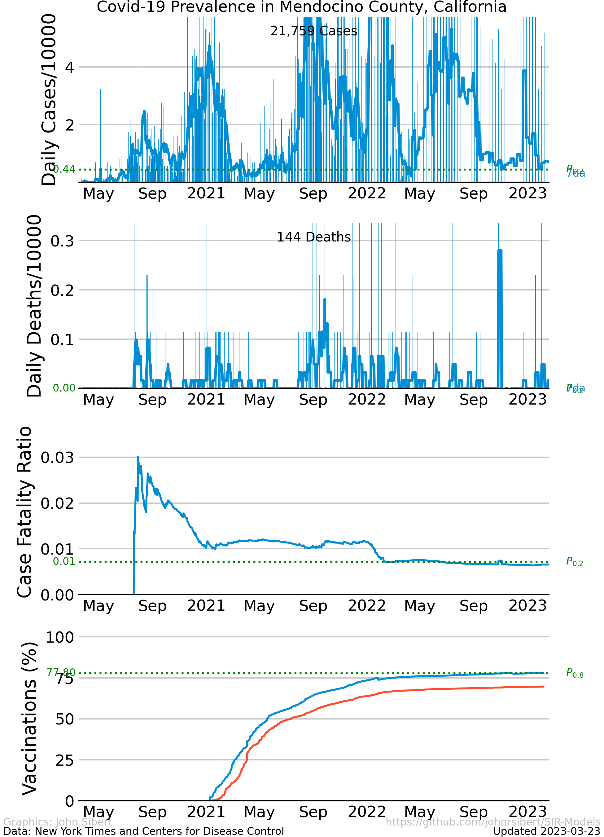
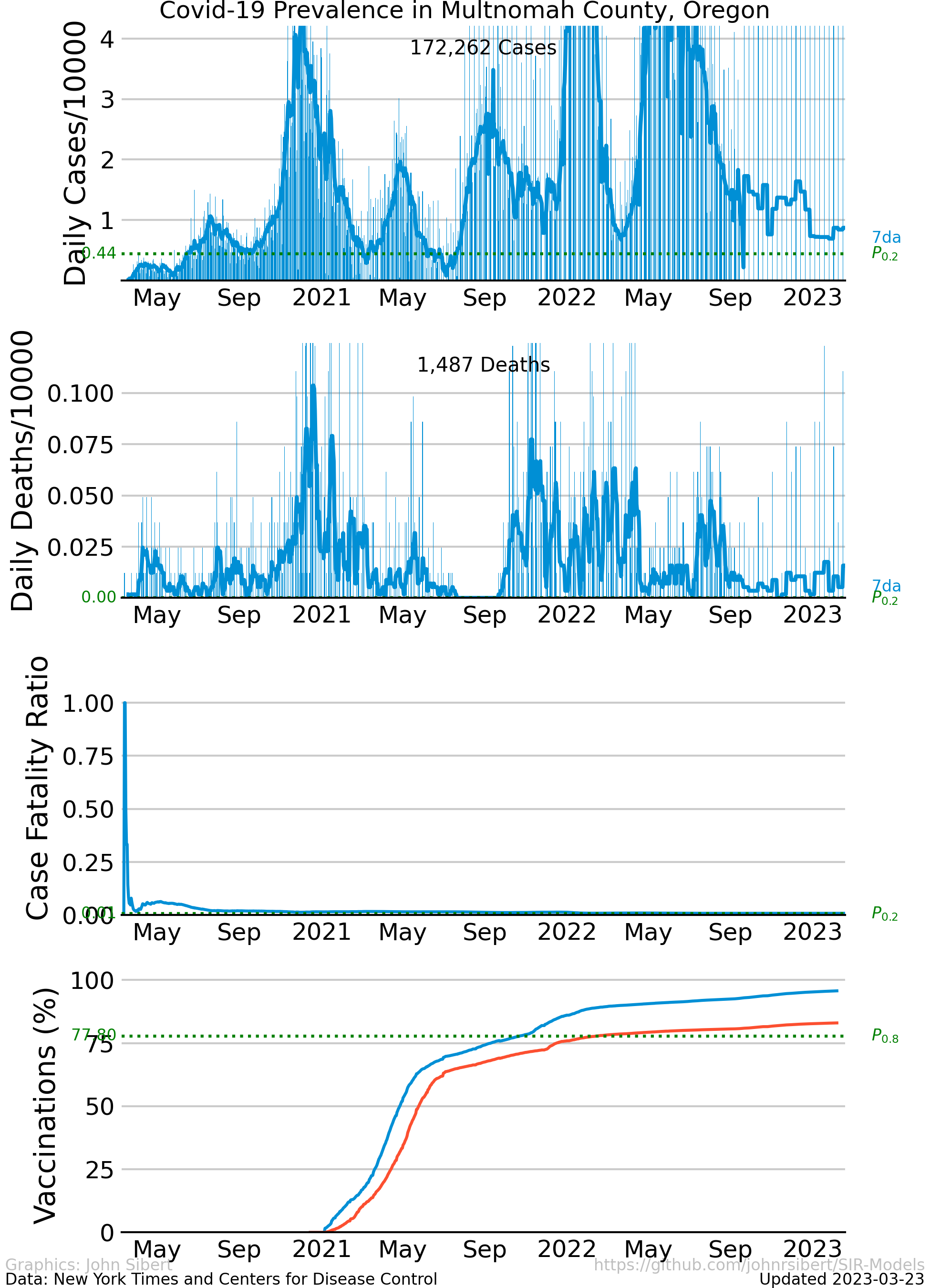
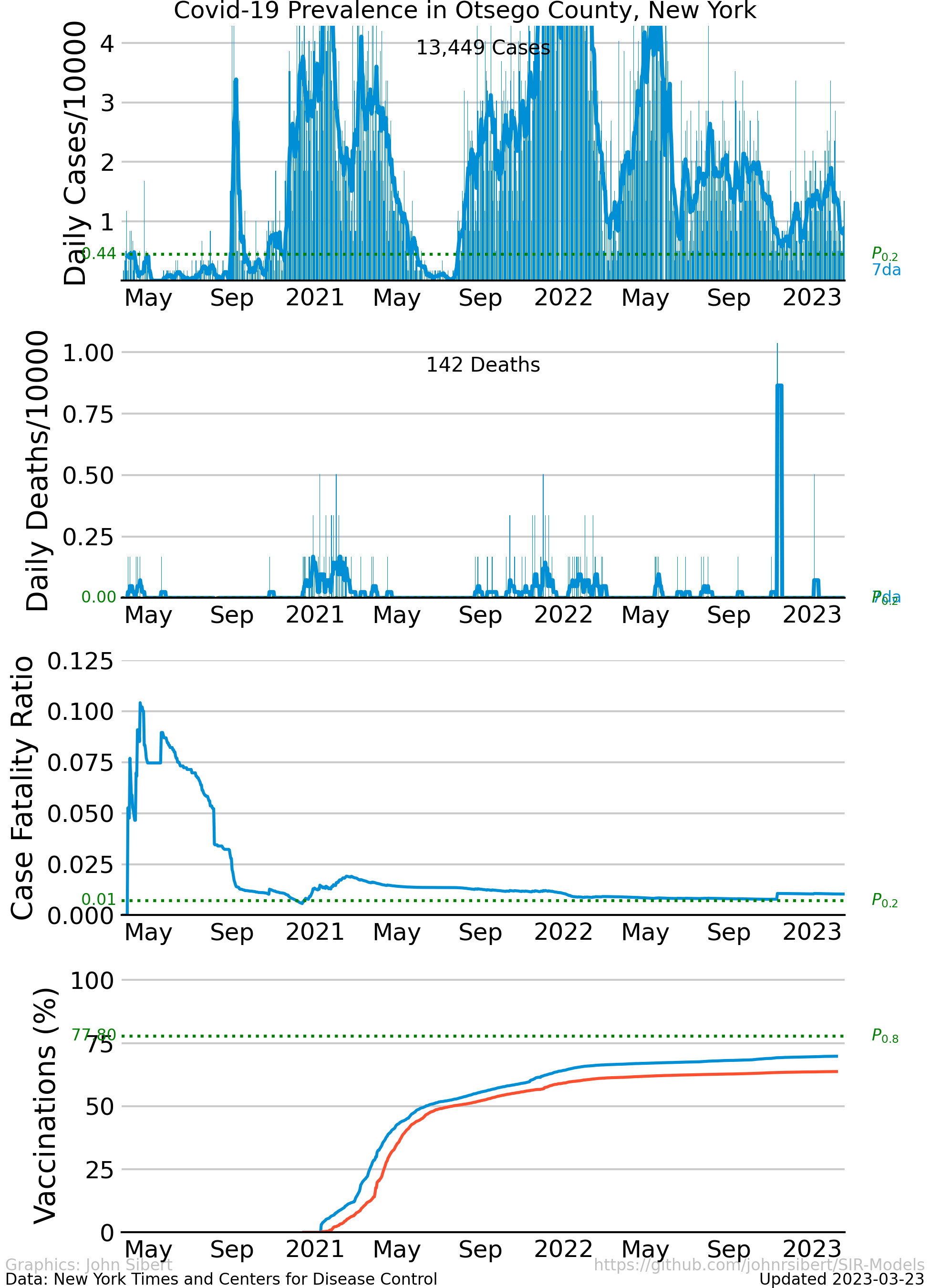
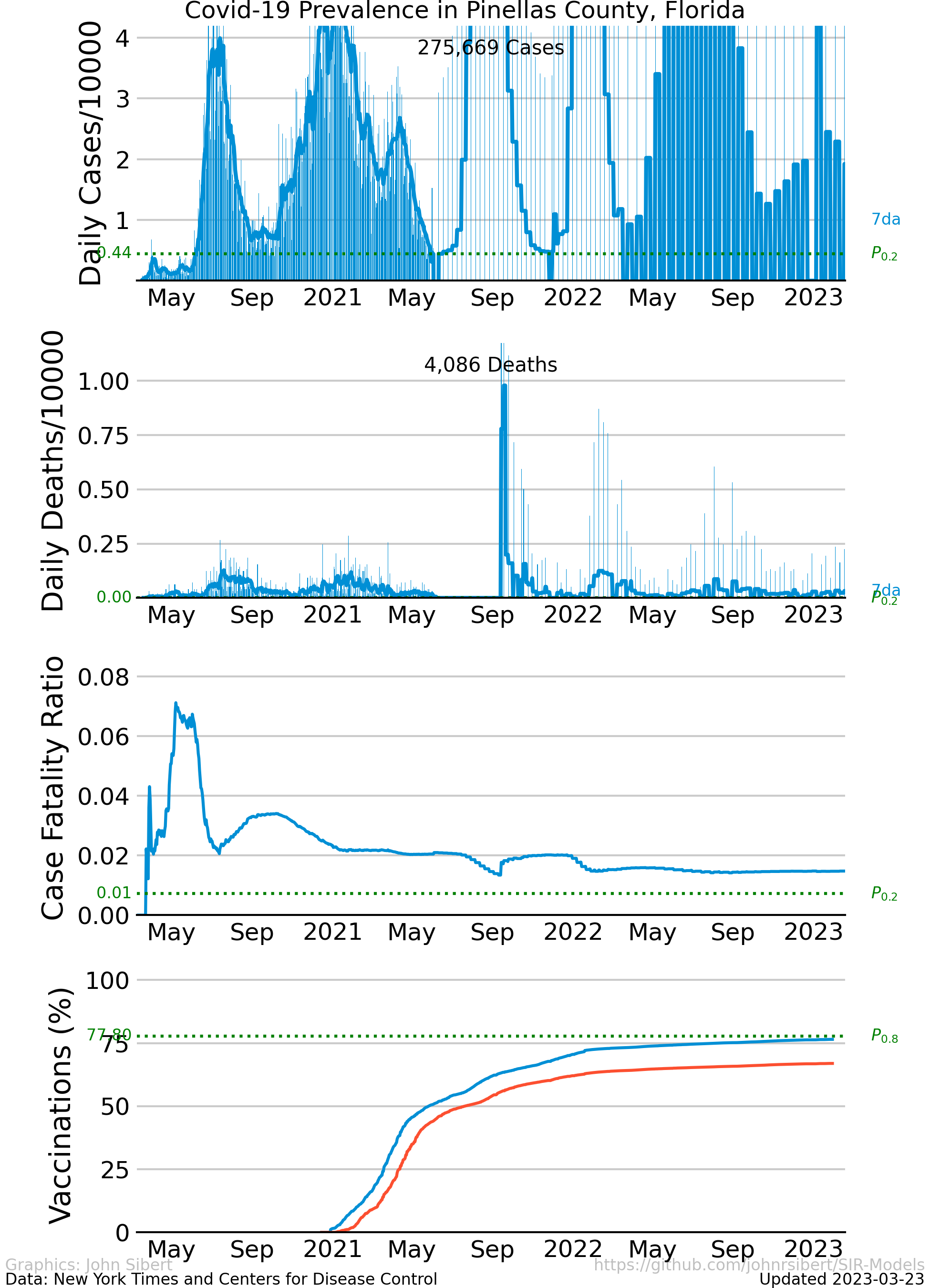
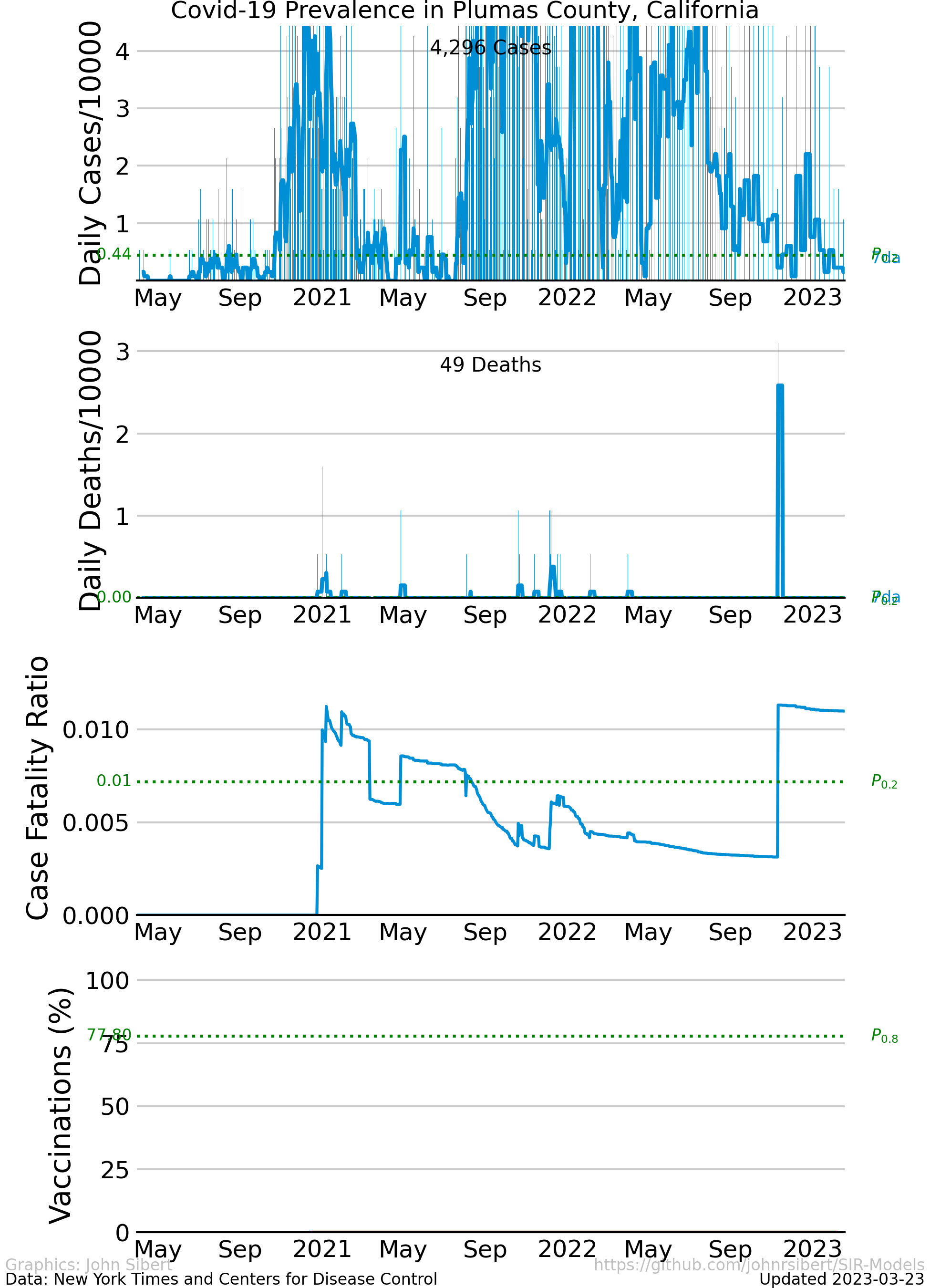
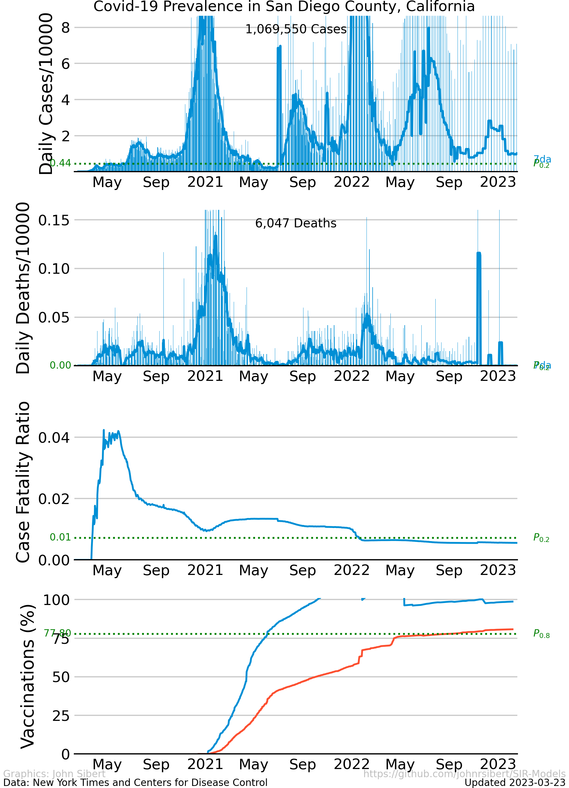
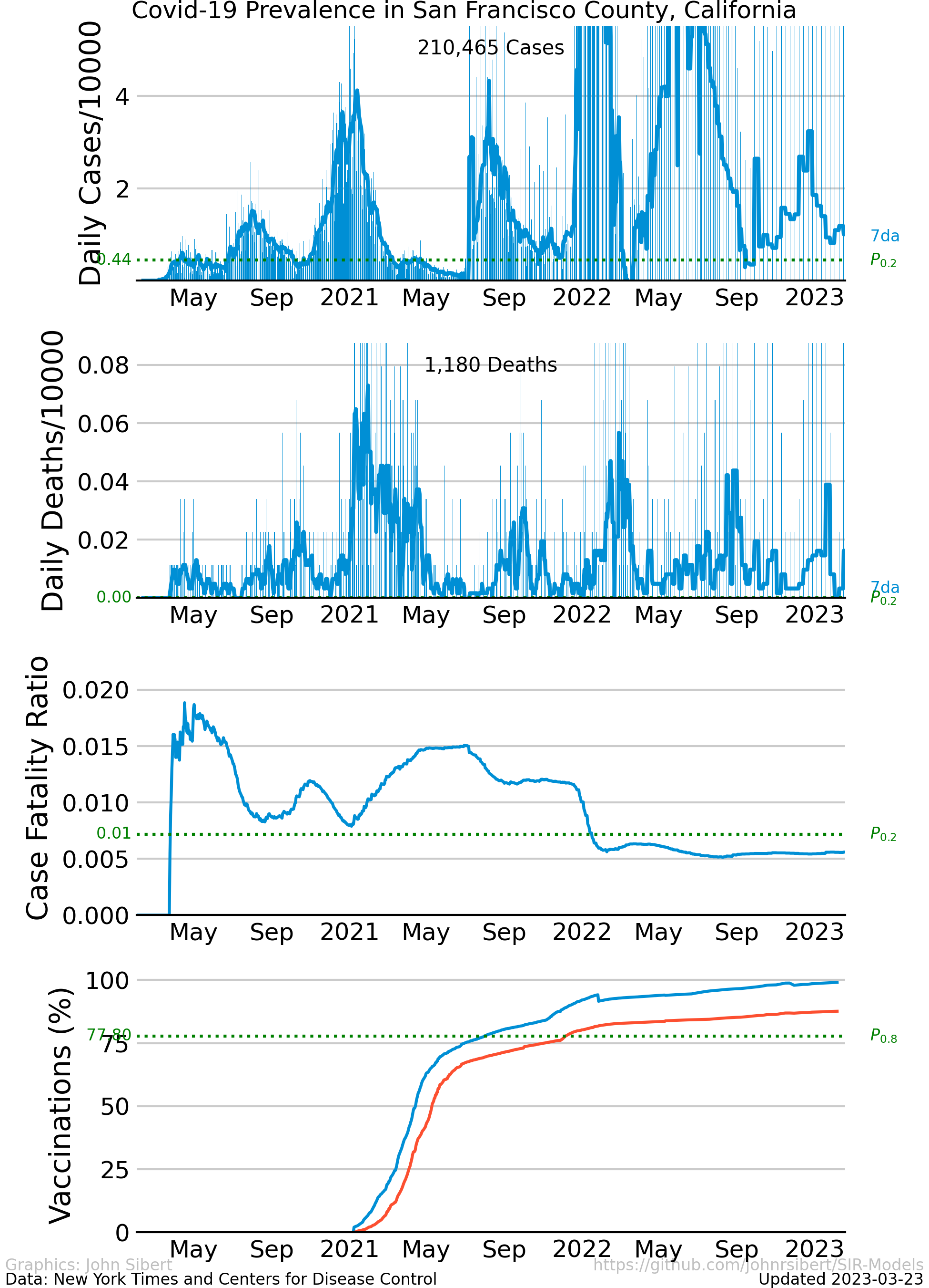
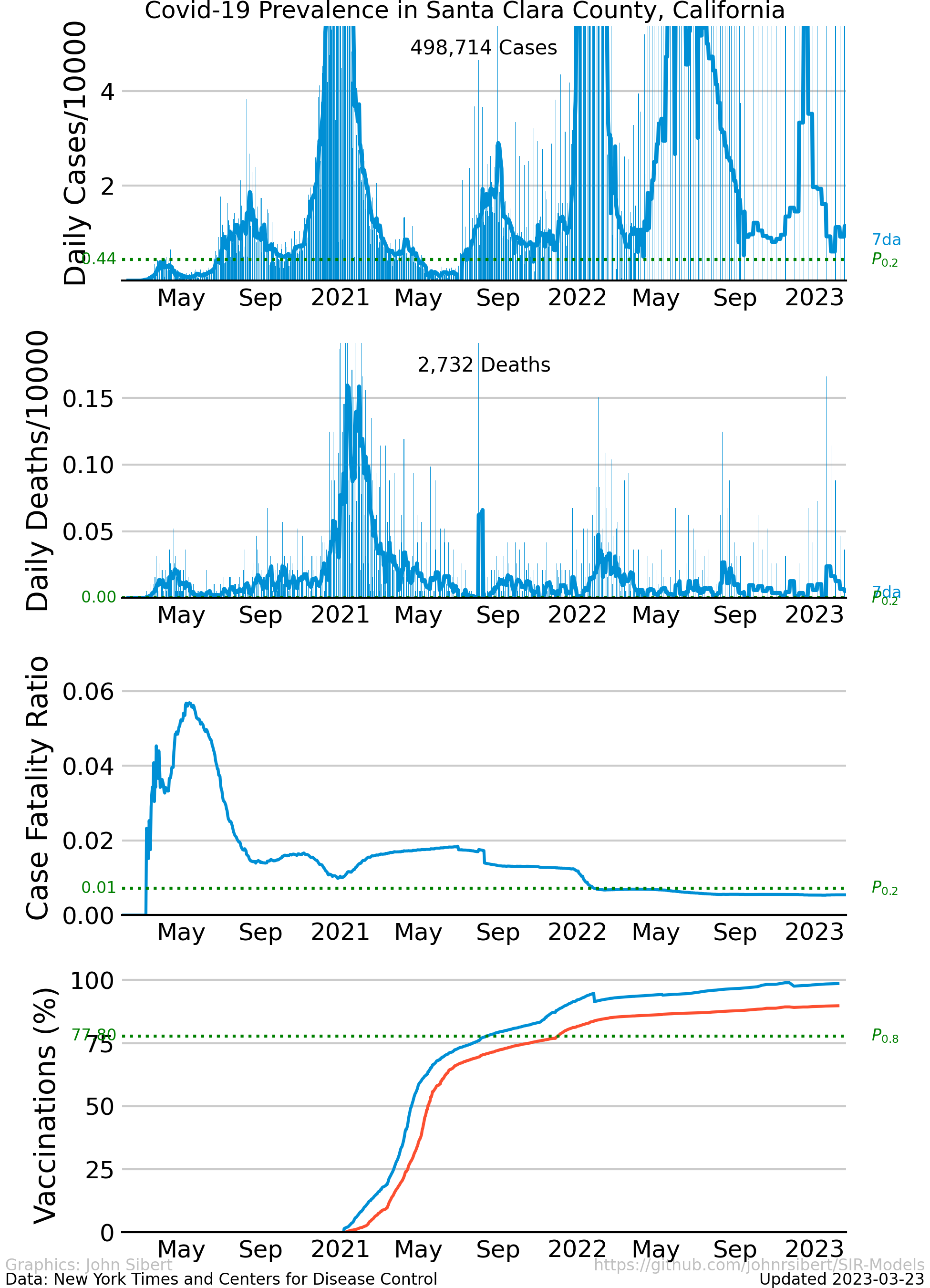
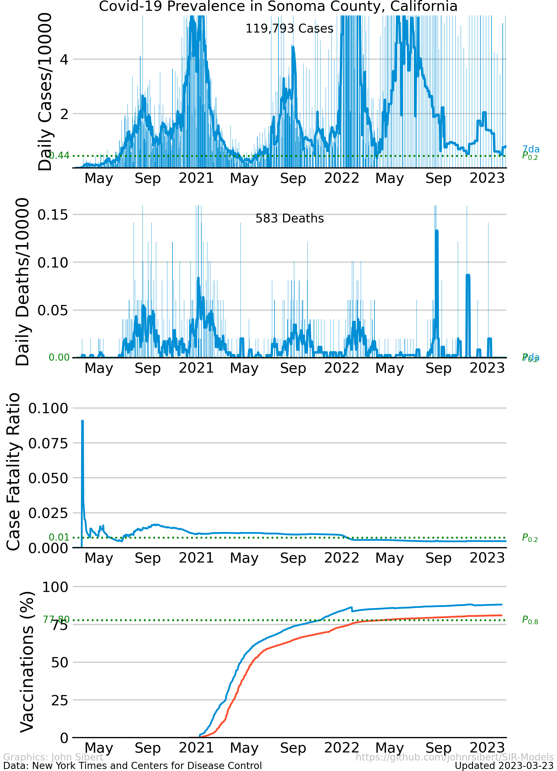
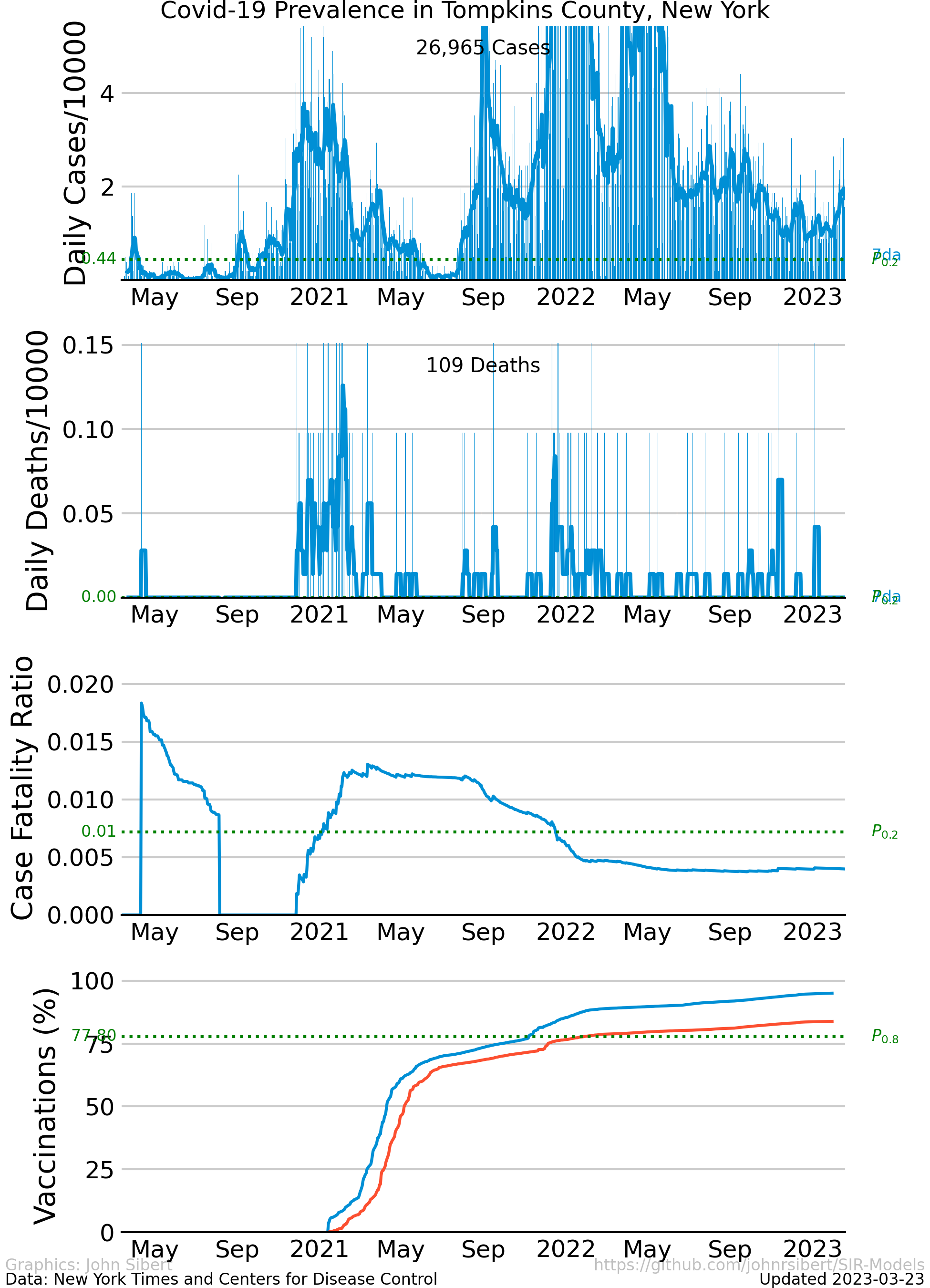
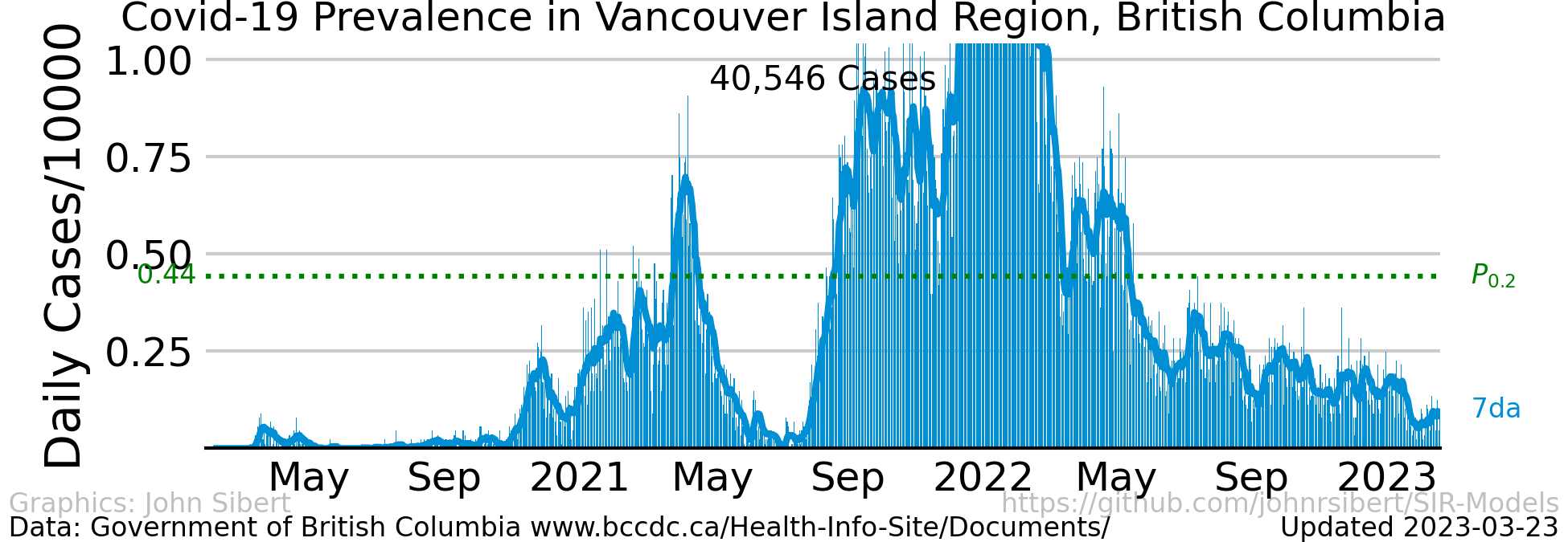
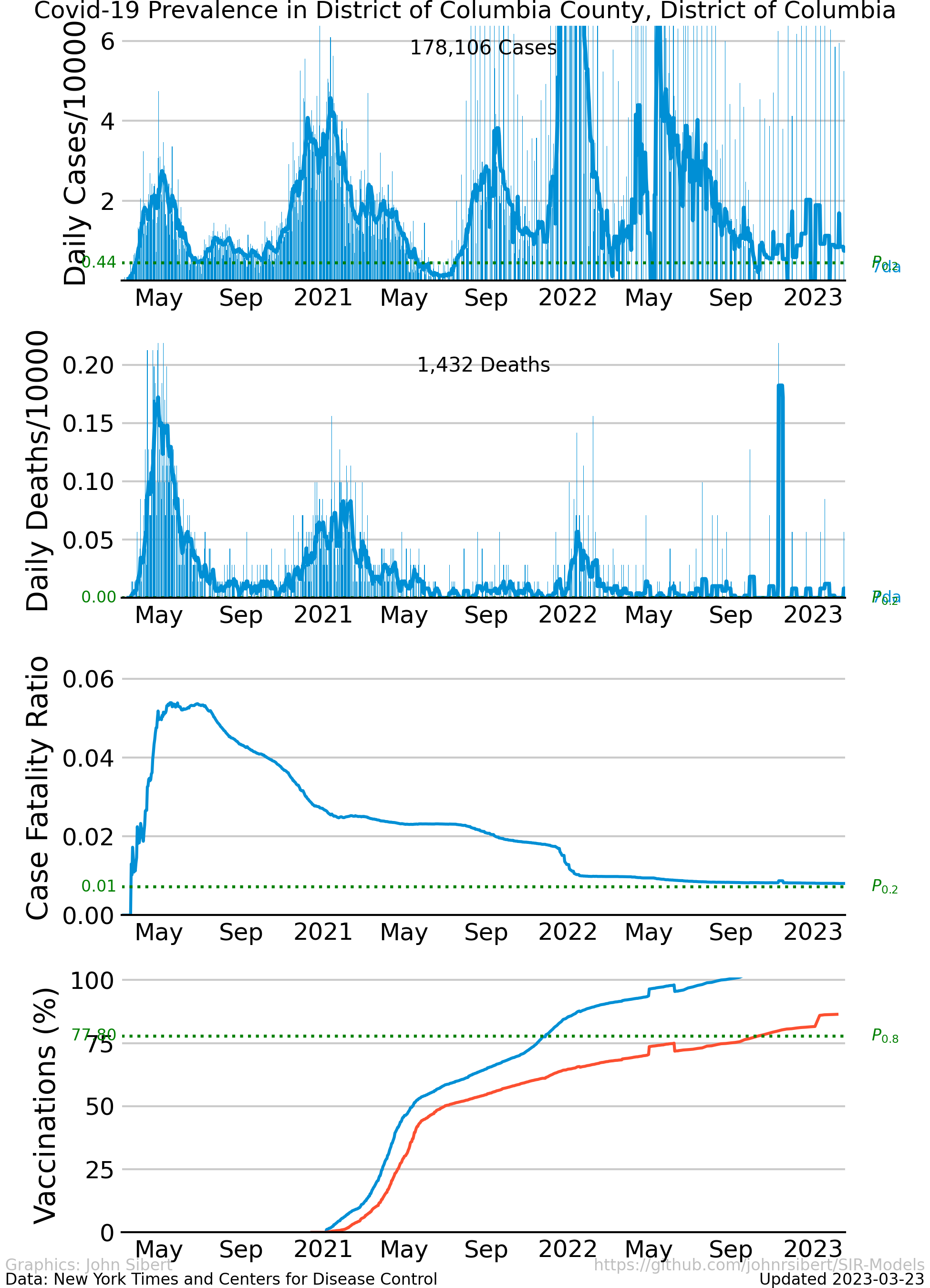
The number of cases and the number of deaths are two common indicators of the severity of a disease outbreak. The number of cases and the number of deaths divided by the total population in an area is a measure of prevalence . The Times data repository is an easy starting point to explore prevalence. The following plots are examples of different trends in the spread of Covid-19 in the two most populous counties in the United states.
The upper panel of each plot shows the number of new cases reported each day as vertical blue lines. The saw-tooth appearance of the vertical lines is smoothed with an 7 day moving average, shown as the heavy blue line marked “7da”. The horizontal dotted green line in the per capita cases graphs is an arbitrary standard to facilitate comparison with other regions. It marks the number of cases per 10,000 people that is less than or equal to the lowest 20% ($P_{0.2}$) of prevalence estimates in the 272 US counties with populations greater than 250,000 people. The prevalence in 80% of all counties is higher than the green line. The second panel of each plot is a similar presentation of the number of new deaths reported each day. The third panel in each plot shows the trajectory of the ratio of deaths to cases (or Case Fatality Ratio, CFR), sometimes considered a rough measure of lethality. The CFR rises and falls over the course of the pandemic reflecting, perhaps, how well local health care facilities are coping with rising case loads. The lower panel is the number of Covid-19 vaccinations reported by the CDC divided by the US census population estimate. The blue line, labeled “first”, is the percentage of the population receiving their first shot (“administered_dose1_recip”); the red line, “full”, is the percentage of the population that is fully vaccinated (“series_complete_yes”).
New York City Prevalence
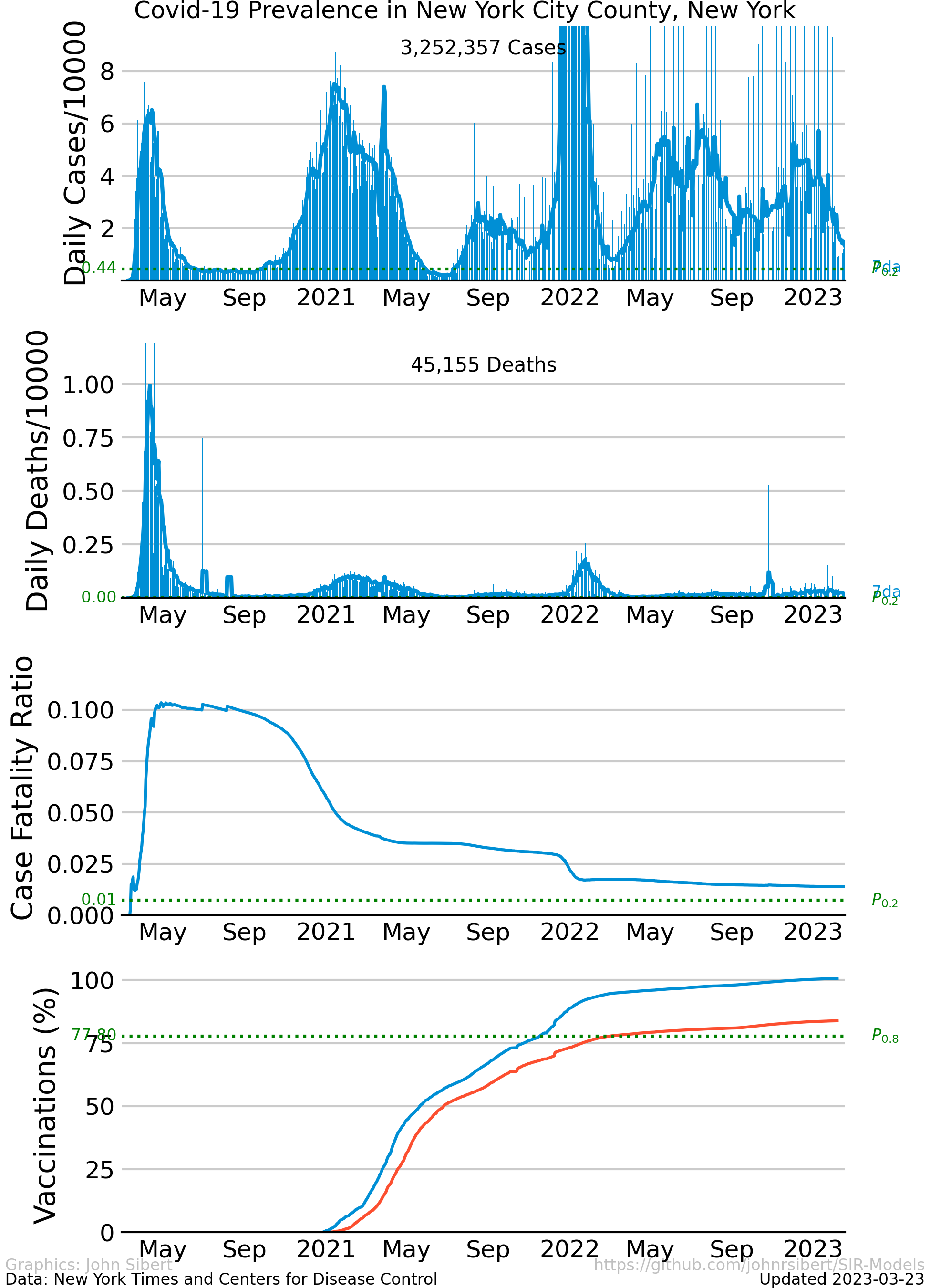
The disease attacked the five counties that comprise New York City aggressively with unchecked exponential growth in infections during March and April of 2020. Quarantine-like measures “flattened the curve” and kept spread of infection at low levels. Numbers of new cases stayed relatively low and constant for 5 or 6 months, but began to increase in October and November. In the Spring of 2022, the number cases increased rapidly, “surged”, for the fourth of fifth time. Surges are usually attributed to the arrival of an newly detected virus variant.
Numbers of daily deaths generally reflects the numbers of daily new cases, rising sharply in April, falling to low levels in June. The CFR in New York City seems unusually high. The ratio is highest in April and May and decreases substantially over the summer to a value about one half of the peak.
Los Angeles County Prevalence
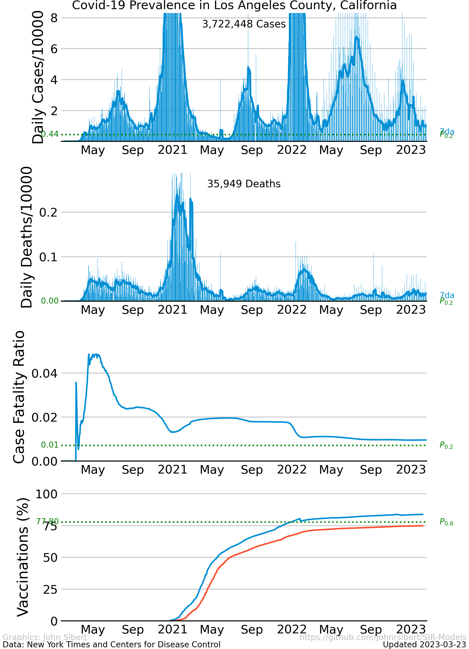
The trajectory of the disease in Los Angeles County is quite different from New York City. Los Angeles was able to avoid the initial exponential growth phase. Instead, the prevalence of the disease grew relatively slowly through the spring of 2020, reaching a mid-summer peak. The disease was controlled for a second time, but exponential growth resumed in December and January. The CFR is generally lower than in New York and shows the same decrease of the summer.
How bad is it where you live?
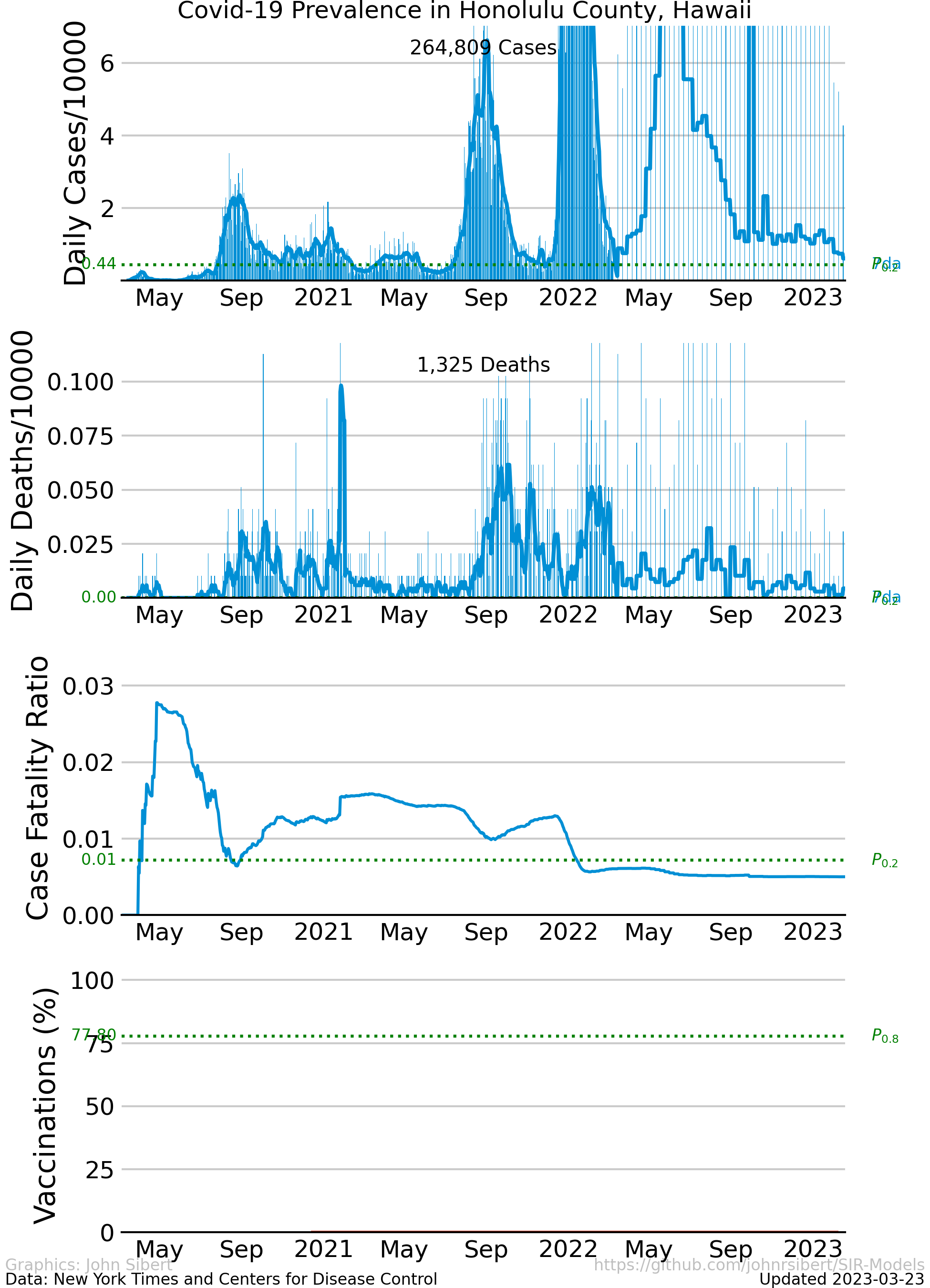
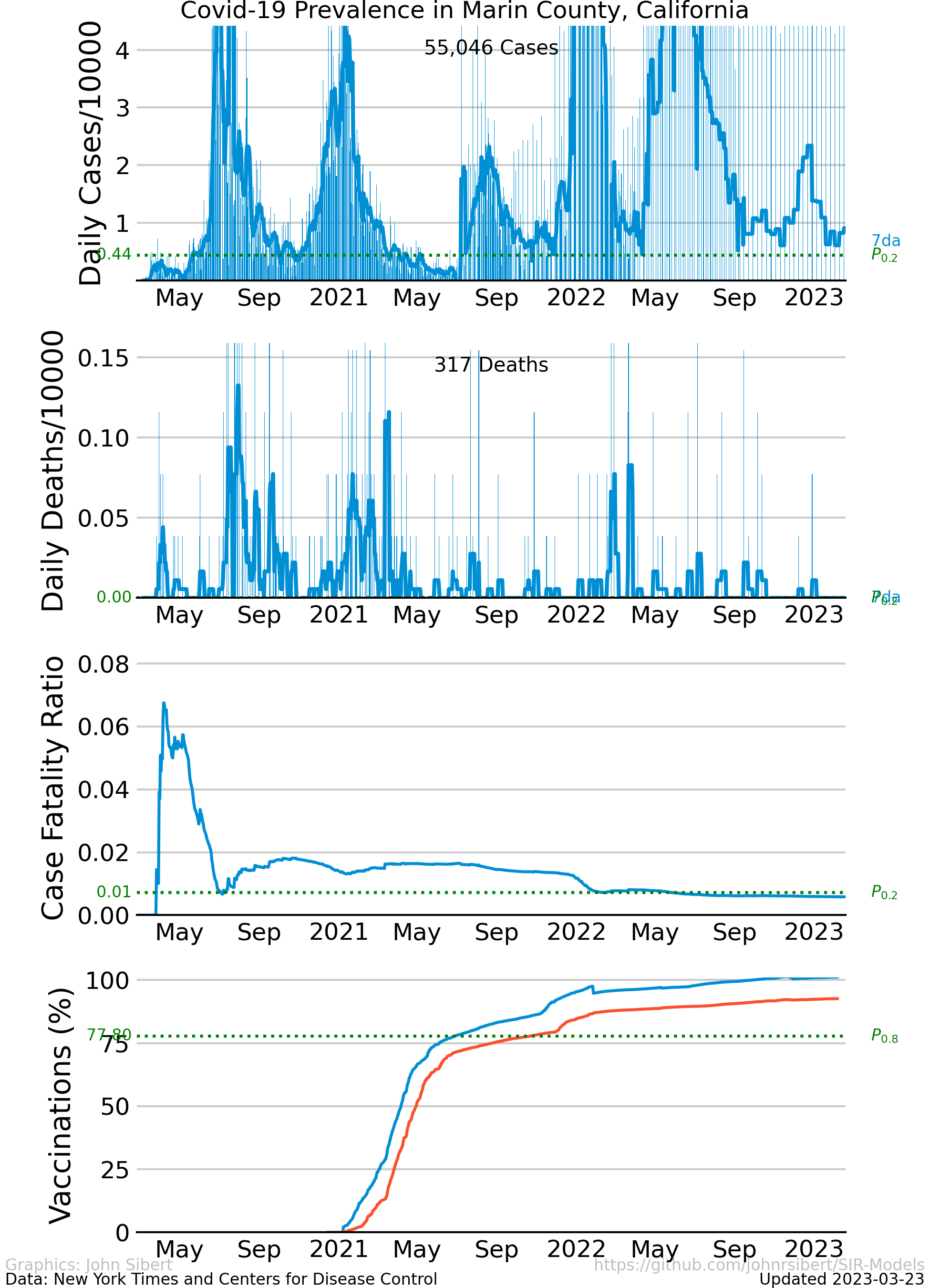
Here is a list of places where some of my friends an family live. Click on the link to see the Covid-19 prevalence in each county. If I’ve omitted a place you love, let me know and I’ll try to include it.
- Alameda County, CA
- Fairfax County,VA
- Honolulu County,HI
- Los Angeles County, CA
- Marin County,CA
- Mendocino County,CA
- Multnomah County, OR
- Otsego County, NY
- Pinellas County, FL
- Plumas County, CA
- San Diego County. CA
- San Francisco County, CA
- Santa Clara County, CA
- Sonoma County, CA
- Tompkins County, NY
- Vancouver Island, BC (Cases only; data on daily deaths not readily available.)
- Washington DC
So, how are we doing?
Politicians made great fusses about “Opening up … “. The vaccines seem effective and safe. The mood seems optimistic. Many of the graphs that I have been sharing show notable decreases in the number of cases per capita, for example.
After more almost three years of watching people die, of being separated from family, of not getting out much, and of breathing through masks, it seems reasonable to ask if it was all worth it.
Prevalence Histories Since April 2021 Compared
Per capita prevalence histories of the largest counties in the 50 US states and the District of columbia.
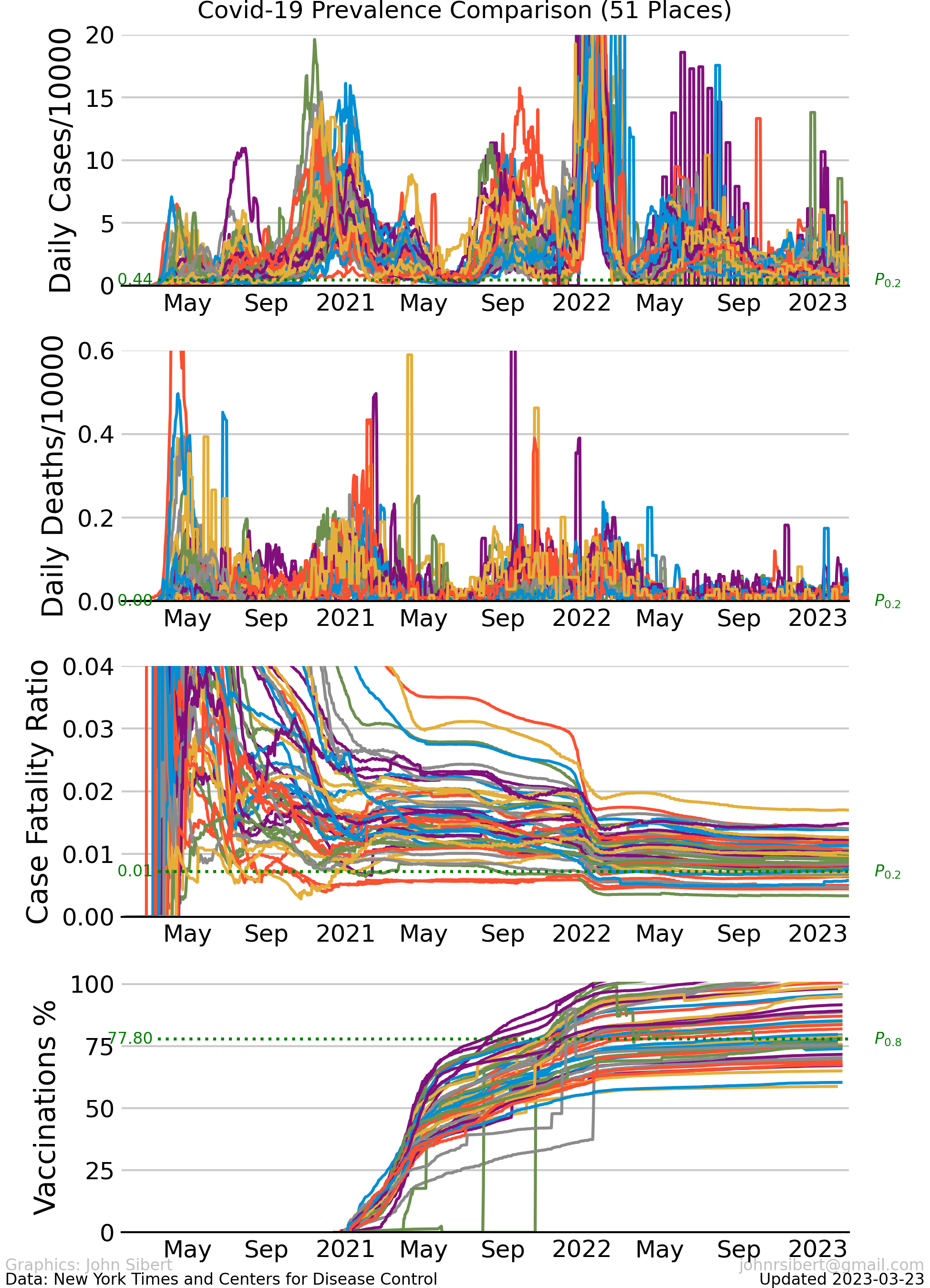
These ugly graphs make it pretty clear that each county is experiencing the pandemic differently, but there are some common features. Recent cases are very high in some counties, but recent deaths are generally quite low. Case-fatality (CFR) ratios were extremely high during the first quarter of 2021 but decreased slowly and stayed fairly constant at between 0.1 and 0.2 for almost one year. A second decrease in CFR occurred during the first quarter of 2022. (CFR trends discussed further here.),
Current Prevalence
Lets just look at the numbers of cases per capita for the last few weeks.
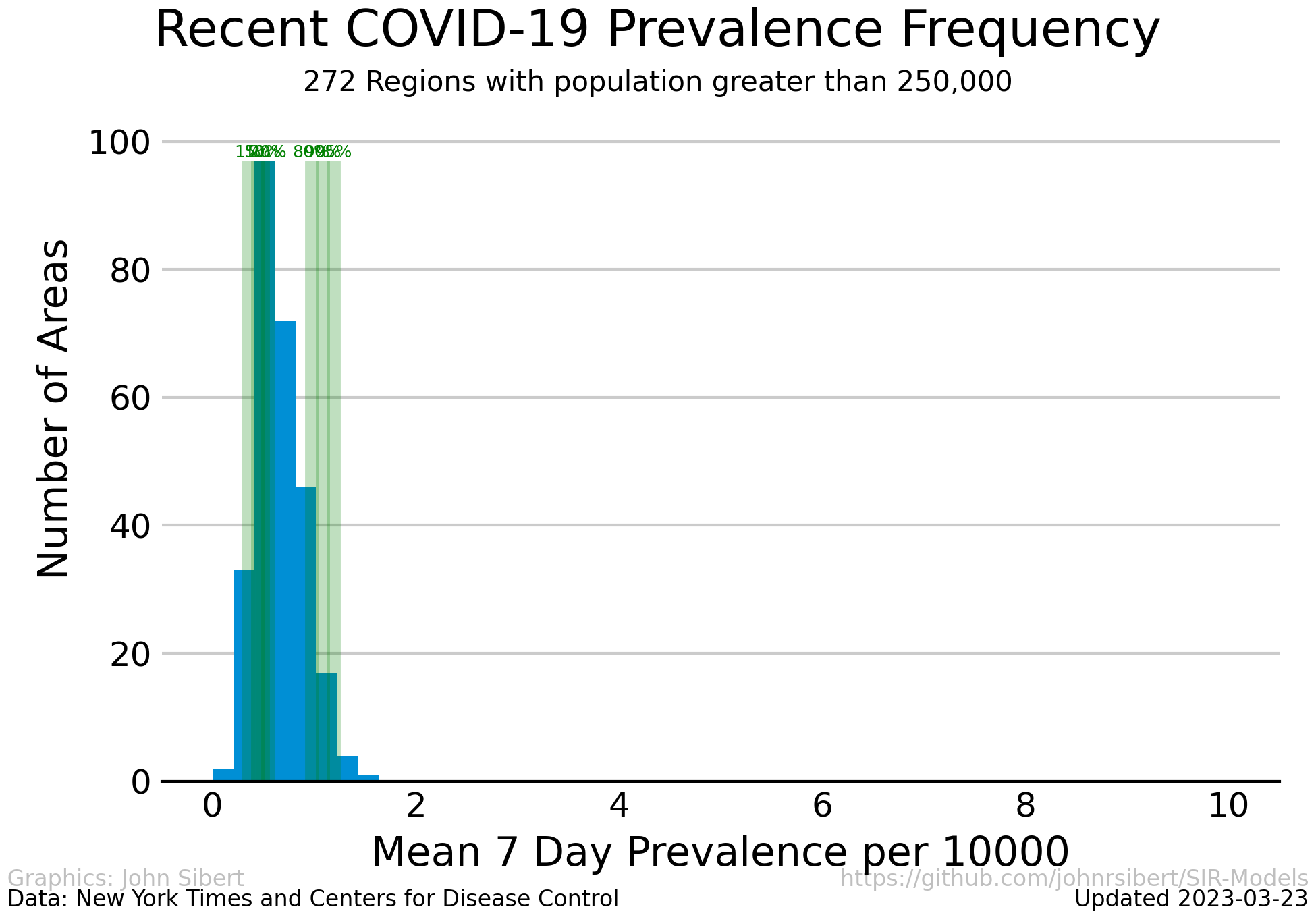
Cases per 10,000 people averaged over the most recent two weeks in regions with more than 250,000 people.
The vertical green lines represent to the 1, 5, 10, 20, 80, 95 and 99 percentiles of the case rates. The case rate is truncated at 10 cases or 10,000, but as the table below shows, case rates range to almost 20. Currently, case rates are less than 1 per 10,000 for 90% if counties considered and less 4 per 10,000 for 80% of counties considered. Counties with prevalence rates less than 0.001 cases per 10,000 people are excluded.
Top and bottom of the range
| Rank | Region | Prevalence |
|---|---|---|
| 0 | Vancouver Island BC | 0.062 |
| 1 | Utah UT | 0.397 |
| 2 | Maricopa AZ | 0.516 |
| 3 | Benton AR | 0.532 |
| 4 | Jackson MO | 0.534 |
| 5 | Douglas CO | 0.570 |
| 6 | Clark NV | 0.574 |
| 7 | Washoe NV | 0.603 |
| 8 | Ventura CA | 0.610 |
| 9 | Greene MO | 0.614 |
| 10 | St. Joseph IN | 0.615 |
| 11 | Ingham MI | 0.630 |
| 12 | Bernalillo NM | 0.631 |
| 13 | Polk IA | 0.659 |
| 14 | Placer CA | 0.660 |
| 15 | Fulton GA | 0.665 |
| 16 | Dallas TX | 0.668 |
| 17 | Ottawa MI | 0.680 |
| 18 | Salt Lake UT | 0.694 |
| 19 | Arapahoe CO | 0.698 |
| ... | ... | ... |
| 228 | Hamilton TN | 1.965 |
| 229 | Ocean NJ | 1.967 |
| 230 | Lexington SC | 1.975 |
| 231 | Essex NJ | 1.978 |
| 232 | Providence RI | 1.979 |
| 233 | Guilford NC | 2.064 |
| 234 | Gloucester NJ | 2.288 |
| 235 | Bergen NJ | 2.305 |
| 236 | Forsyth NC | 2.317 |
| 237 | Cumberland NC | 2.321 |
| 238 | Mercer NJ | 2.321 |
| 239 | Henrico VA | 2.341 |
| 240 | Fayette KY | 2.356 |
| 241 | Rutherford TN | 2.395 |
| 242 | Knox TN | 2.415 |
| 243 | Camden NJ | 2.474 |
| 244 | Burlington NJ | 2.515 |
| 245 | Passaic NJ | 2.517 |
| 246 | East Baton Rouge LA | 4.149 |
| 247 | Jefferson AL | 6.670 |
Updated 2023-02-11
How dangerous is it?
The number of reported deaths divided by the number of reported cases, or case-fatality ratio (CFR), is often considered to be a measure of the risk of dying from a pandemic (CDC Principles of Epidemiology). The following plots illustrate some of the relationships between an deaths and cases and summarize current Case Fatality ratios.
Deaths vs Cases, Simplified
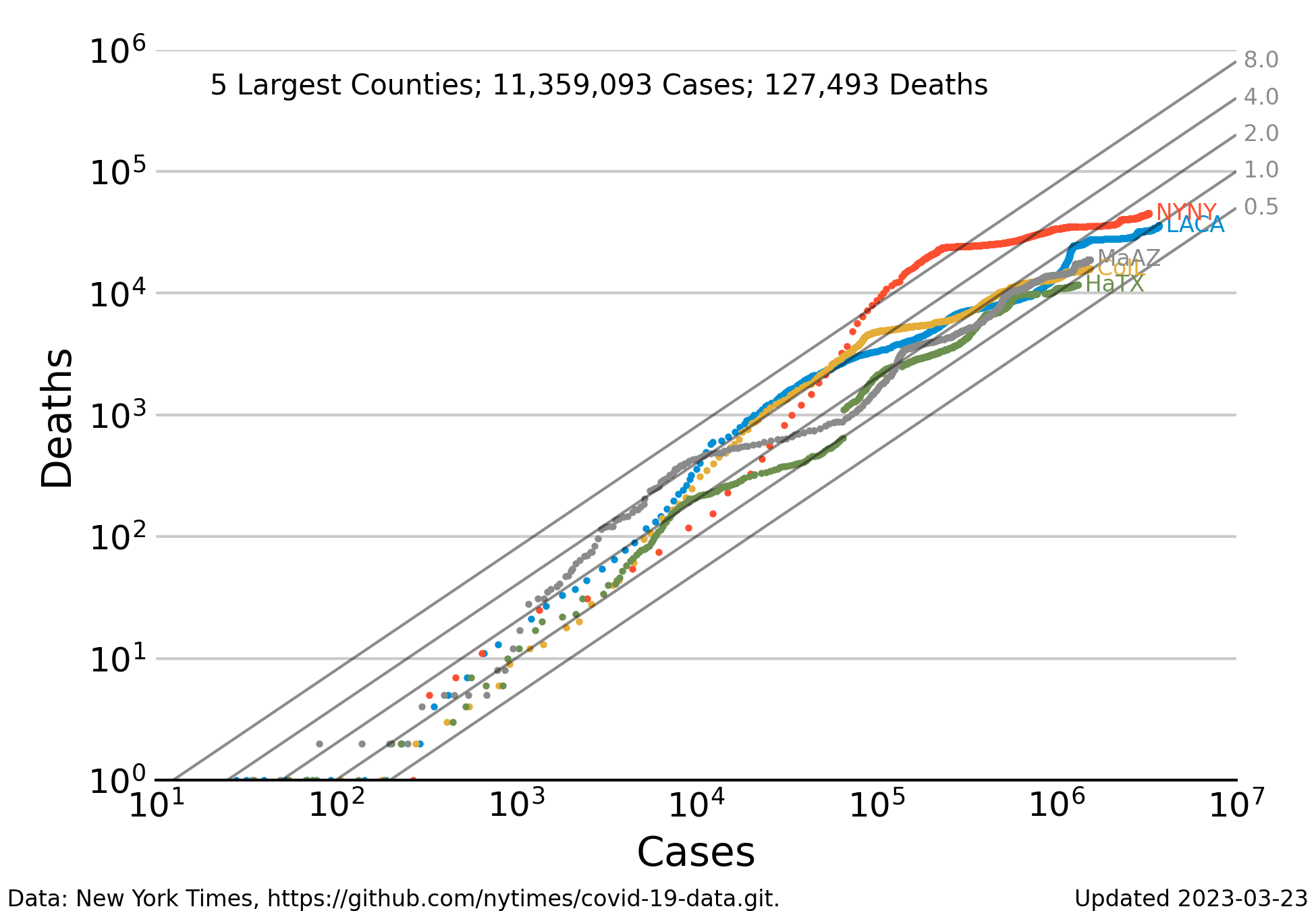
The relationship between reported cases and reported deaths for the 5 largest counties in the United States (Los Angeles CA, New York City NY, Cook County IL, Maricopa County AZ, and Harris TX) since the beginning of the pandemic. Each dot represents one record (i.e. one day). The number of deaths is low when the number of cases is less than 100, but increases regularly in proportion to the number of cases for all counties. The gray diagonal lines indicate mortality rates ranging from 0.5% to 8% of reported cases. When the number of cases exceeds 1000 the dots begin to form lines tracing the history of each county. Even with this relative small number of counties, the trajectories seem to converge to mortality rates near 1% as the number of deaths increases. Data for several counties exhibit a downward bend where the trend seems to shift from 0.2 to 0.1. Put another way the probability of dying from contracting Covid-19 is currently about half of what it was at the start of the panemdic. It has decreased from approximately 2% to approximately 1%.
Deaths vs Cases, ugly
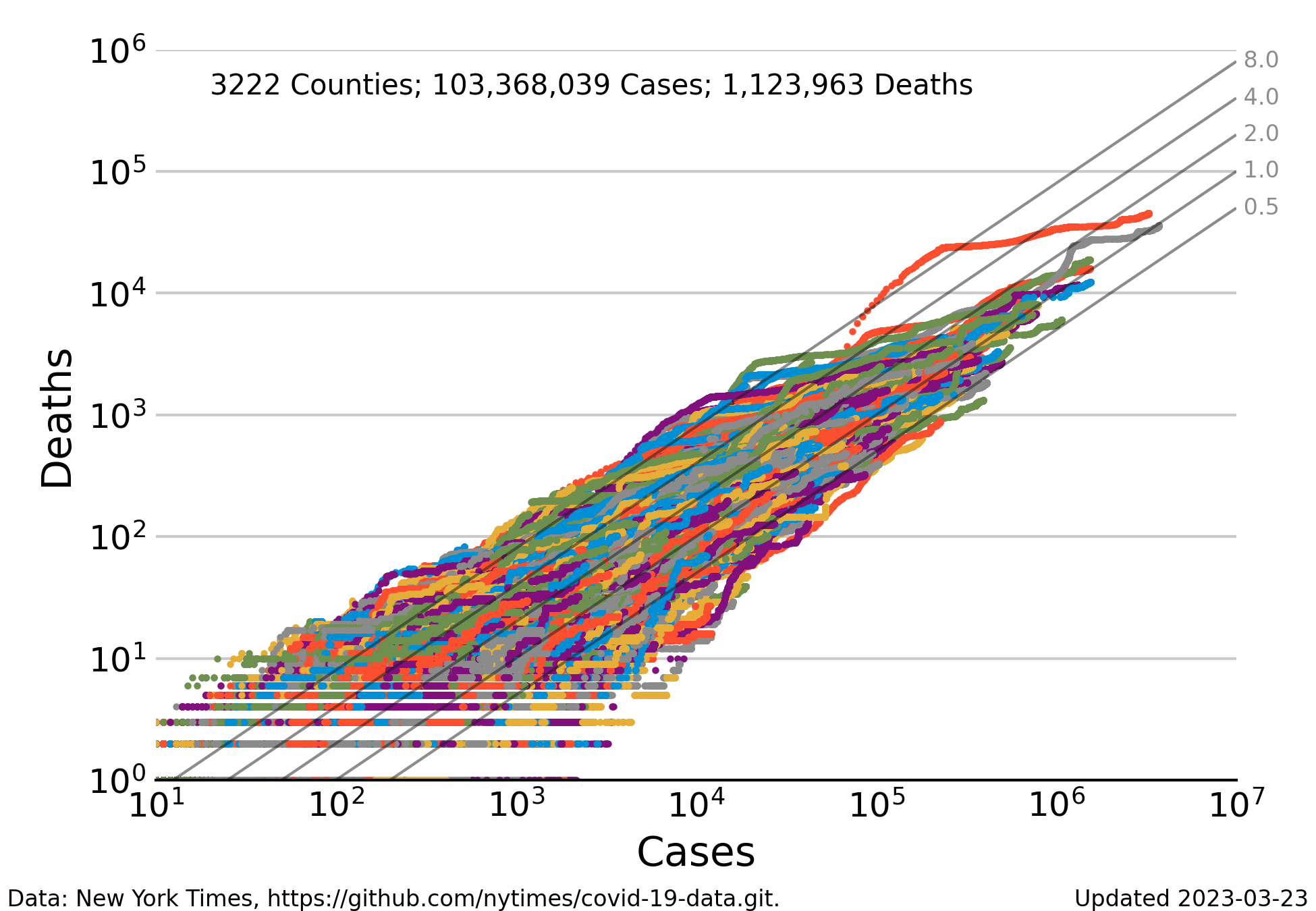
Relationship between reported cases and reported deaths for the most populous counties in the United States. The number counties makes it difficult to differentiate the complete history of a single county from the mess of colored dots. Nevertheless the general trend of the swarm of points converges to a mortality rates near 0.2, and then bends downward toward current values near 0.1.
Case Fatality Ratio (CFR)
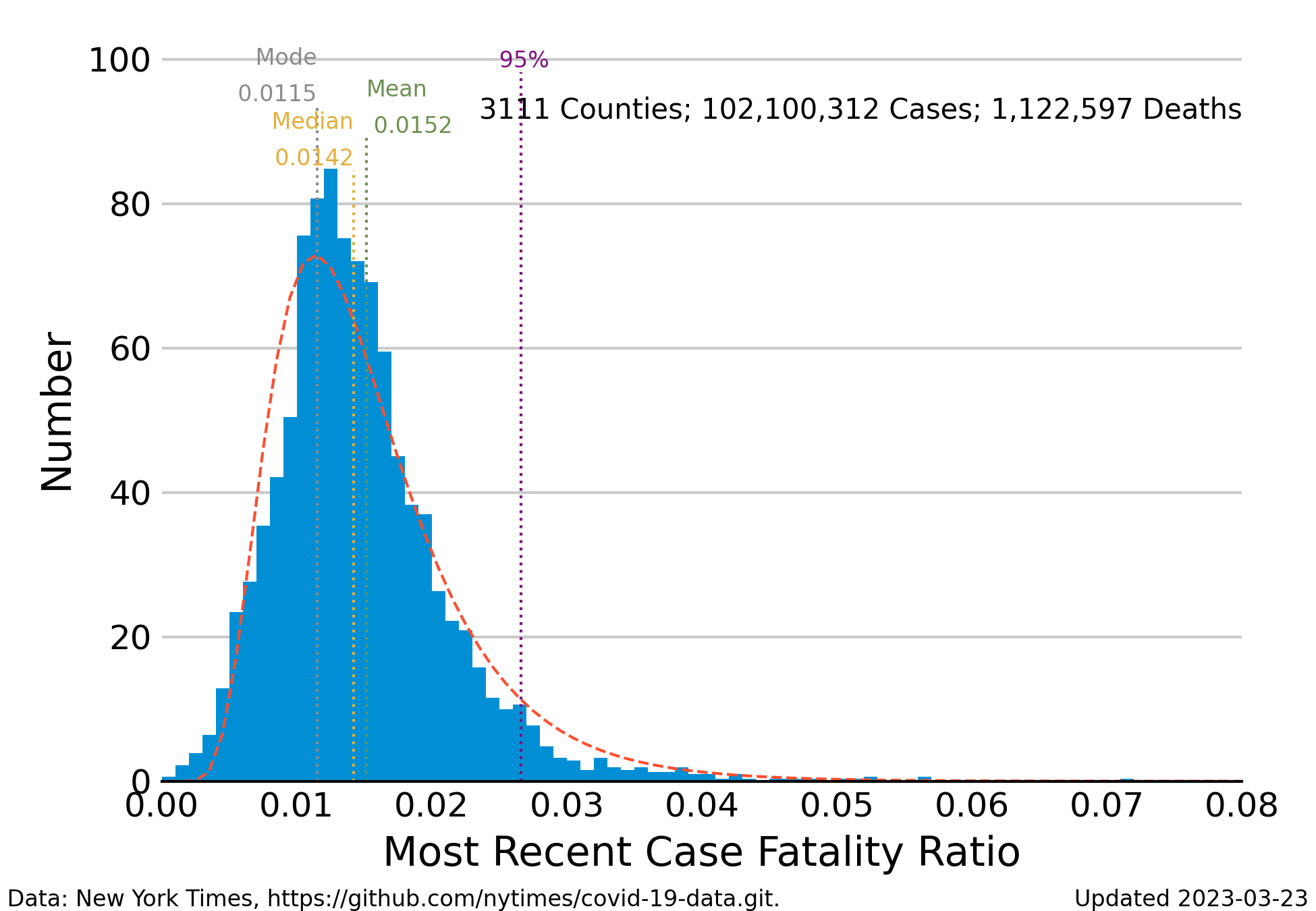
Frequency distribution of the case-fatality ratio (deaths/cases) averaged for the most recent 7 days of reporting.
The blue bars indicate the number of CFR values that fall into intervals along the horizontal axis. The median of the ratios is approximately 0.015 for a morality rate of 1.5%, but there is a substantial number ratios greater than 0.02 up to a maximum of 0.05. The Johns Hopkins University Coronavirus Resource Center pegs the case-fatality ratio in the United States to be about 1.2 deaths for 100 confirmed cases down from 2 deaths per 100 cases in early 2020.
The distribution of observed CFRs is skewed to the right, making it difficult to calculate an unambiguous central tendency. The median of the distribution lies to the right of the mode (or peak). A less misleading measure of the likelihood of death is to look at the percentiles of the distribution. The vertical line labeled “95%” indicates the value of the case fatality ratio that is greater than 95% of all of the estimates. If the CFR distribution were symmetrical, this point would be something like the upper 95% “confidence” region of values indistinguishable from the mean value. In other words, if you were to say that the probability of dying after becoming infected is less than 3%, you would be correct about 95% of the time.
The are a couple of reasons why the distribution is skewed. Skewness is, in part, a simple numerical artifact. The mean of the CFR is close to zero, but a ratio can never be less than zero. So, the left limb of the distribution must include fewer instances than the right limb. There are also medical reasons for the skewness. The larger number of values to the right of the peak are possibly deaths of the people most vulnerable to Covid-19: people older that 65 years, people with compromised immune systems or other vulnerabilities, and of course the unvaccinated.
The dashed curve that outlines the histogram is the theoretical log-normal frequency distribution estimated to the observed case-fatality ratios. This distribution model is commonly used for describing skewed distributions. The log-normal curve appears to correspond pretty well to the histogram.
Changes in the Case Fatality Ratio Distribution
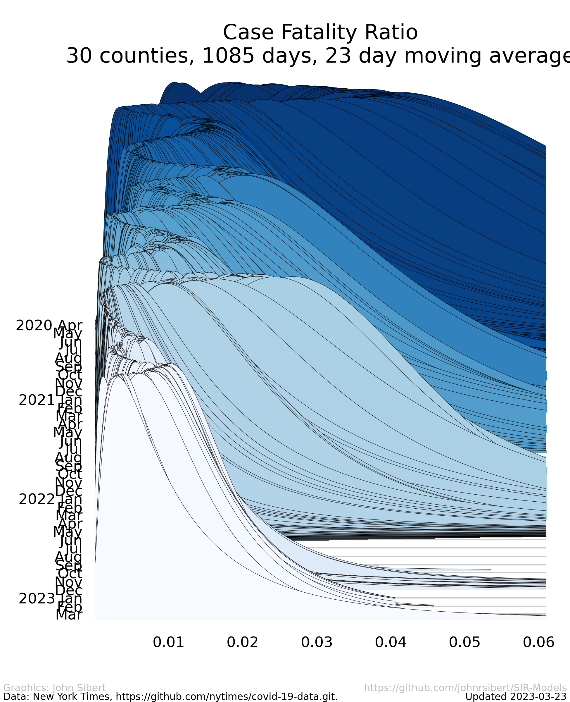
Estimated long-normal probability distribution of the CFR for each day of the pandemic since April 1, 2020 scaled so to that the sum of the probabilities on each day sum 1.0.
The right hand tail has expanded and contracted over the course of the pandemic so that probabilities of death appear to have been higher during periods when the prevalence was also high. Recent weeks have seen dramatic decreases in the the probability of death.
Model Results (wonkish)
Fisheries scientists, ecologists, and epidemiologists are usually faced with the challenge of analyzing data that are presented to them. These data are seldom collected with the aid of a well planned and meticulously executed experimental design. The data may contain errors of many kinds, and there is no guarantee that methods of data collection have not changed over time and are consistent across strata. Furthermore, it is not feasible to repeat the observations or to wait another year for more data to accumulate. Analysts are thus faced with the twin quandaries selecting a model with which to interpret the data and of determining whether information in the data is sufficiently uncompromised by error to inform a statistical estimation process. One of the questions posed in my modeling effort was to ask whether the data collected in an ad hoc way from multiple jurisdictions, compiled for journalistic purposes, and made public in near real time could be useful for statistically estimating parameters of epidemiological models.
SIR models are often used in epidemiology. These models resolve the effected population into several “compartments”, Susceptible, Infected, and Removed. The data at hand, however include just one of these compartments, assuming that “Cases” in the data are a measure of the Infected compartment. “Deaths” in the data to not correspond to the any compartment of the standard SIR models. My first steps were to simplify (some might sat oversimplify) the SIR model to a model of Infected compartment and to add a Deaths compartment. This two compartment model is considered to represent coupled processes of infection and death with the introduction random variation in both infection and death. SIR models are often expressed as a set of coupled ordinary differential equations (ODEs) with constant parameters. We live in a world where we are attempting to change the dynamics of the spread of the epidemic. When we attempt to regulate social behavior and to improve medical care, we are, in fact, attempting to alter the rate parameters in the SIR ODEs. It is therefore and error to assume that the ODE parameters are constant. I assume that the rate parameters of the coupled processes are variable in time and treat them as random effects that may vary over time. Maximum likelihood is used for model estimation combining likelihood contributions computed for both cases and deaths. This framework enables simultaneous estimation of time dependent series of both the reported cases and the reported deaths. A summary description of the model and some preliminary (as of August 2020) results is available for download (pdf). The has evolved somewhat since the preliminary write-up in August 2020, but model development ceased in late 2021.
Model conclusions
The data at hand are sufficiently informative to estimate the parameters of a simplified SIR model. The estimated transmission and mortality rates trends seem consistent with the observed prevalence trajectories. However the rapidly increasing proportion of fully vaccinated people effectively reduces the size of the Susceptible compartment. Model development was abandoned in March 2021, but further work, perhaps including vaccination rates, would be appropriate.
Rant
We have known how to prevent the spread of disease since the Tenth century when the Persian polymath Ibn Sina recommended confining sick people for 40 days. The Venetians adopted the practice in the Fourteenth Century and called it quarantine. If we were serious abut saving lives, we would get serious about staying away from sick people. In fact, some places did pretty well practicing social isolation over the course of the summer. Have a look at the prevalence graph for New York City; other places, not so much. We know how to protect ourselves with masks, we can slow the spread of infection, we can survive the infection if we get prompt care, and, best of all, a vaccine is in sight.
We began to seriously learn about vaccines in about 200 years ago. It didn’t get really technical until we began to understand the immune system in the 20th century. Science guided to eradicate smallpox. I’m old enough to remember the great fear of polio in the 1950s. I know people who where afflicted with polio. Science guided us further to eradicate polio in many countries. Measles, mumps, rubella, and more are on the hit list. Highly effective Covid-19 vaccines (yes plural!) are here and finding their way into arms. We are both cursed and blessed to live in the time of Covid-19. The curse is obvious. We risk losing family, friends and coworkers. The blessing is that it arrived 2019 and not 2015. The astonishing recent progress made by the global community of molecular geneticists had enabled development of safe and efficacious vaccines in less than a year. It raises the hair on the back of my neck. We also need to credit the physicians and nurses who have worked so hard to reduce mortality. The case fatality ratio has decreased steadily over the last two years. The scientists and health care workers who have shepherded us through this horrible period should be feted as the heroes of the early Twenty-first Century.
The English village of Eyam in Derbyshire has become topical recently. In 1665, the villagers of Eyam chose to quarantine themselves for longer than one year. They allowed no one to enter or leave the village, they looked after one another, and they subsidized the other residents of Derbyshire to provide necessities. We can survive this pandemic, but we need to pay attention to Science. Equally important we need to insist that political leaders actually lead to provide the economic and logistical support required to get us through.